Creating a Stunning Neon Text Effect with CSS
Neon text effects have a timeless allure that adds a vibrant and futuristic touch to your designs. In this tutorial, we’ll explore how to create a captivating red neon text effect using CSS. Follow along to give your text that glowing, electrifying look!
Getting Started
To start, let’s set up a basic HTML structure. Open your favorite text editor and create an HTML file. Here’s a simple starting point:
<!DOCTYPE html> <html lang="en"> <head> <meta charset="UTF-8"> <meta name="viewport" content="width=device-width, initial-scale=1.0"> <link rel="stylesheet" href="styles.css"> <title>Neon Text Effect</title> </head> <body> <div class="neon-text" data-text="NEON">NEON</div> </body> </html>Now, create a new file calledstyles.cssand link it to your HTML file. This is where we'll apply the CSS magic.
The CSS Magic
In your styles.css file, let’s define the styles for our neon text:
body {
background-color: #000;
display: flex;
align-items: center;
justify-content: center;
height: 100vh;
margin: 0;
}
.neon-text {
font-family: 'Arial', sans-serif;
font-size: 3em;
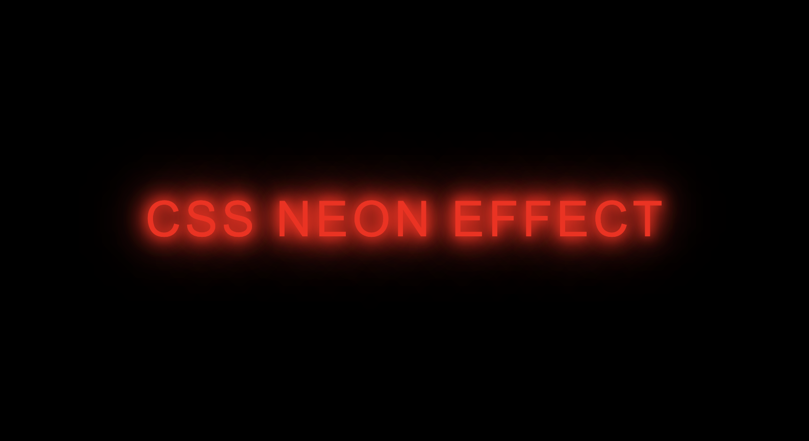
color: #ff0000; /* Red color for the text */
text-shadow: 0 0 10px #ff0000, 0 0 20px #ff0000, 0 0 30px #ff0000; /* Multiple shadows for the neon effect */
position: relative;
letter-spacing: 4px;
}
.neon-text::before {
content: attr(data-text);
position: absolute;
top: 0;
left: 0;
right: 0;
bottom: 0;
z-index: -1;
text-shadow: 0 0 20px #ff0000, 0 0 40px #ff0000, 0 0 60px #ff0000; /* Additional shadows for the background glow */
}
In this CSS code:
- We set the background color of the body to black for a classic neon contrast.
- The
.neon-textclass defines the styles for our glowing text. Thetext-shadowproperty is the key here, creating multiple shadows that simulate the neon glow effect. - The
::beforepseudo-element is used to create a background glow, enhancing the overall neon look.
Customize and Explore
Feel free to experiment with the code. You can change the font family, adjust the colors, or even try different shadow values to achieve your desired effect. The beauty of CSS is its flexibility, so don’t hesitate to get creative!
That’s it! You’ve successfully created a stunning red neon text effect using CSS. Implement this technique in your web projects to add a touch of futuristic flair.
Absolutely! Here’s the revised ending of your blog article with a link to the CodePen:
Happy coding!
Ready to implement this neon text effect? Dive into the code and bring your designs to life! If you have any questions or want to share your creations, we’d love to see them. Feel free to check out the live demo on CodePen and experiment with the code.
Now, go ahead and infuse that neon magic into your projects. Happy coding!
[codepen_embed height=”300″ default_tab=”html,result” slug_hash=”abXEKLG” user=”chamaraindrajith”]See the Pen <a href=”https://codepen.io/chamaraindrajith/pen/abXEKLG”>
Untitled</a> by Chamara Indrajith (<a href=”https://codepen.io/chamaraindrajith”>@chamaraindrajith</a>)
on <a href=”https://codepen.io”>CodePen</a>.[/codepen_embed]


